Skip to content Skip to content
Logo: Wesleyan University

WesGIS

Mapping and spatial data analysis at Wesleyan University

WesGIS
  • K Diver
    • Research
    • People
    • Teaching
    • cv
  • WesGIS
    • GIS Assistant Program
    • GIS teaching
    • GIS research
  • Newsfeed
  • Events
    • Workshops
    • Seminars
  • Gallery
    • Gallery
    • Student projects
    • Maps in the Media
  • Resources
    • Data sources
    • GIS blogs
    • Jobs & Internships
    • Training
    • Facilities
  • Equity

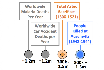
Death Toll Comparison Visualization

October 26, 2013October 26, 2013 by kdiver

An interesting infographic illustrating human death tolls of significant events worldwide through time.

Categories Big data, Map gallery
Post navigation
Conservation GIS Class in Mexico
3D Map of Matterhorn by Drones

Recent Posts

  • Software Engineer opening with Conservation Biology Institute
  • GIS Analyst job in MA
  • GIS specialist job with Terraformation (can work remotely)
  • GIS research associate job with Colorado State and NPS
  • GIS Analyst job at CT GIS Office

Categories

© 2022 Wesleyan University