Students in the winter session course E&ES271Z Mapping the Pandemic spent two and a half weeks critically evaluating existing maps and apps related to the current pandemic, learning how to use ArcGIS Online to analyze and visualize data spatially, and creating their own maps and apps. See below for a sampling of the story maps and dashboards. Click on the titles or images to open a project. (Some projects are not shared publicly.)
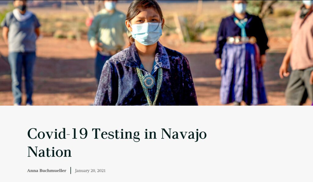
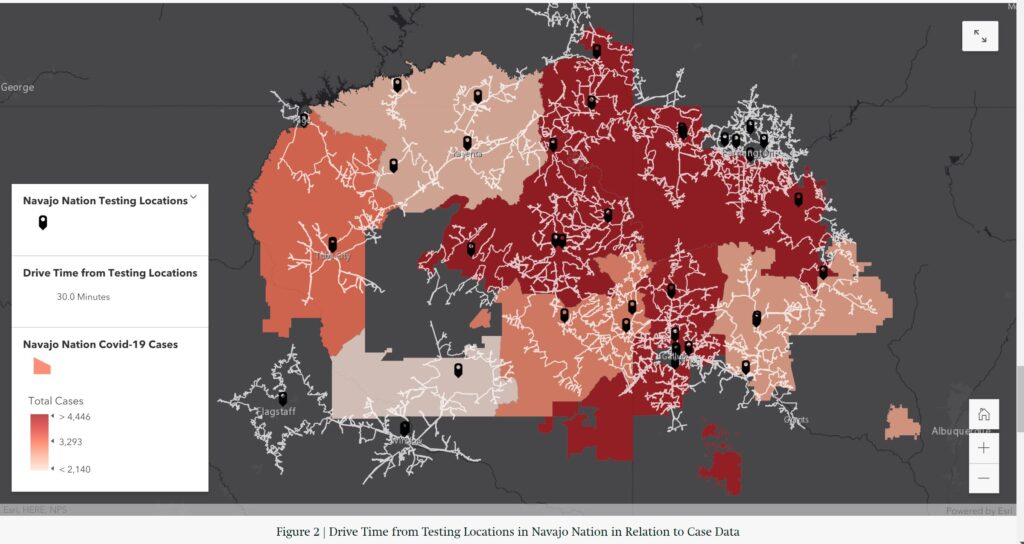
COVID-19 Testing Locations and Cases in the Navajo Nation by Anna Buchmueller (’22 AMST, THEA)
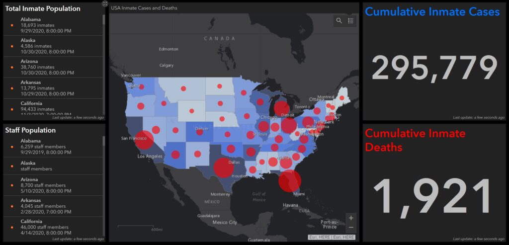
Prison Life During a Pandemic by Nora Butler (’24)
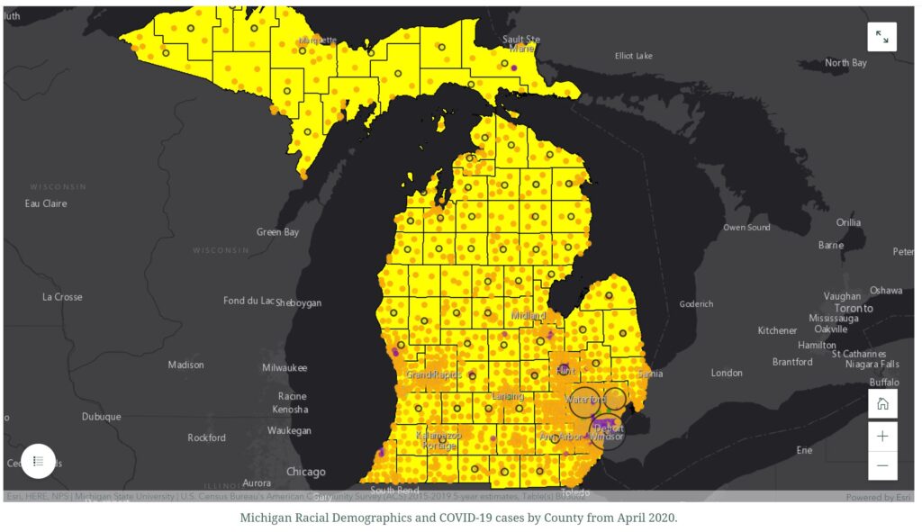
Charting the Racial Disparities of COVID-19 in Detroit, MI by Perri Easely (’23)
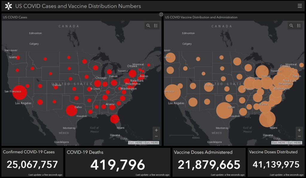
COVID-19 Cases and Vaccinations Dashboard by David Gottleib (’22 GOVT)
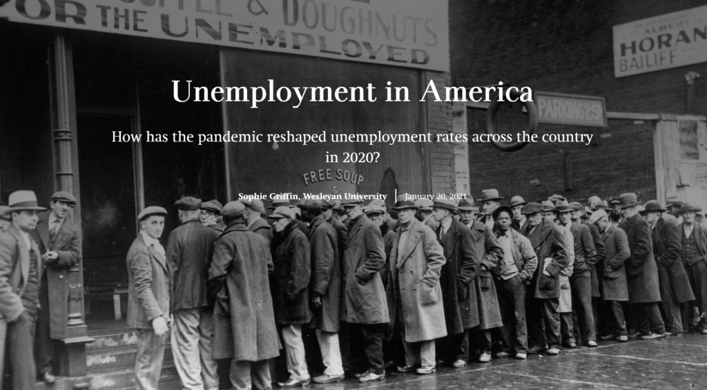
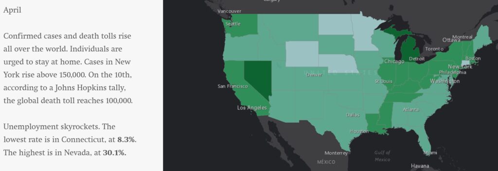
Unemployment in America by Sophie Griffin (’23)
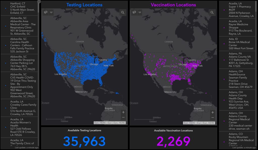
COVID-19 Testing and Vaccination Locations by Elizabeth Irvin (’23)
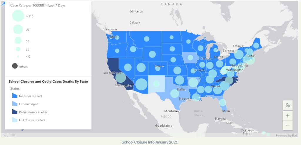
US School Closures by Madeleine Matz (’21 ANTH, ENGL)
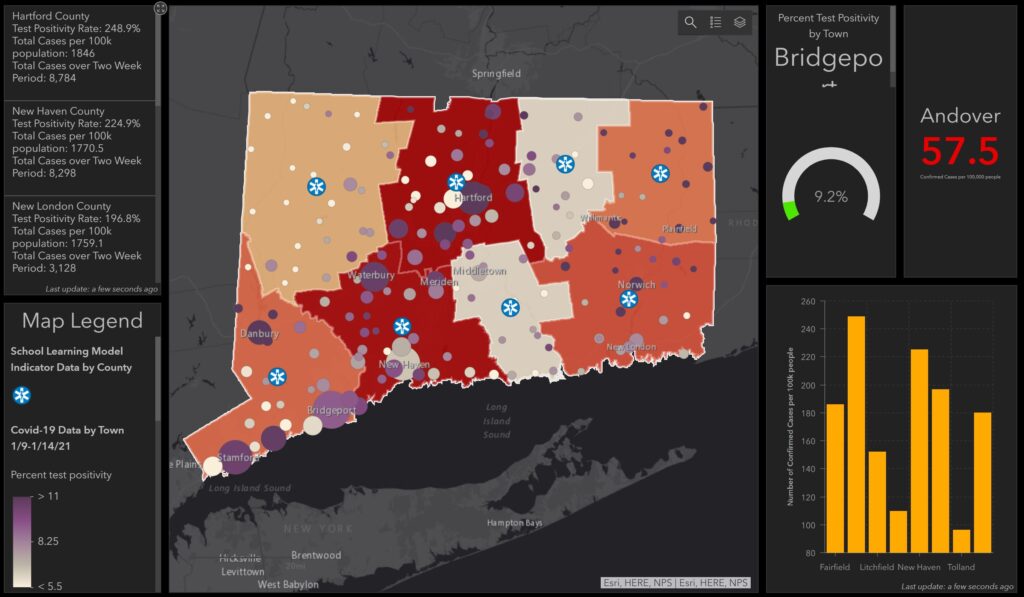
Mapping Connecticut School Closure Models by Joshua Merkin (’23 ARHA)
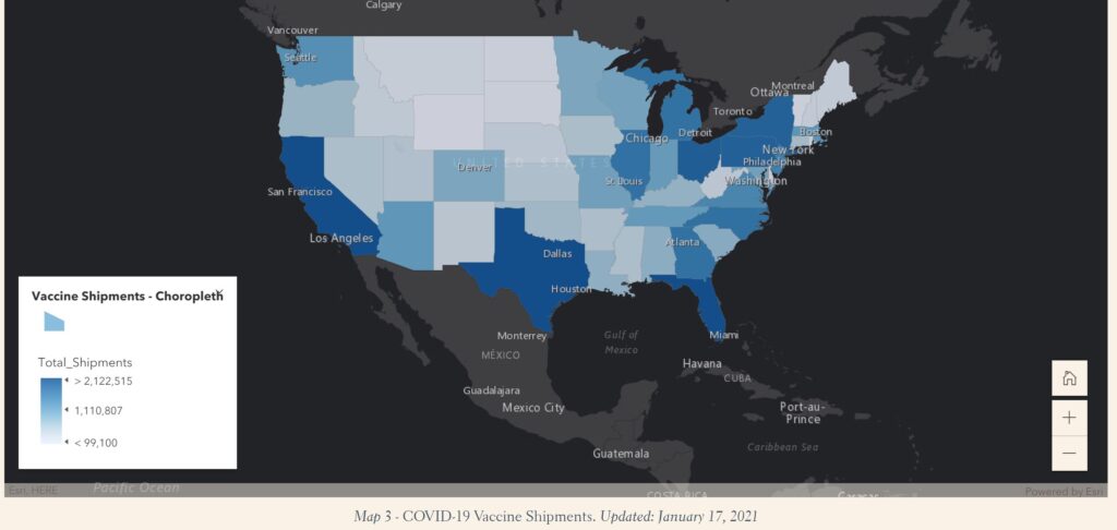
Vaccine Locations by Ava Nederlander (’22 CIS, COMP)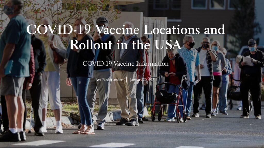
Economic Vulnerability in the US due to COVID-19 by Aashni Parikh (’22 E&ES, BIOL)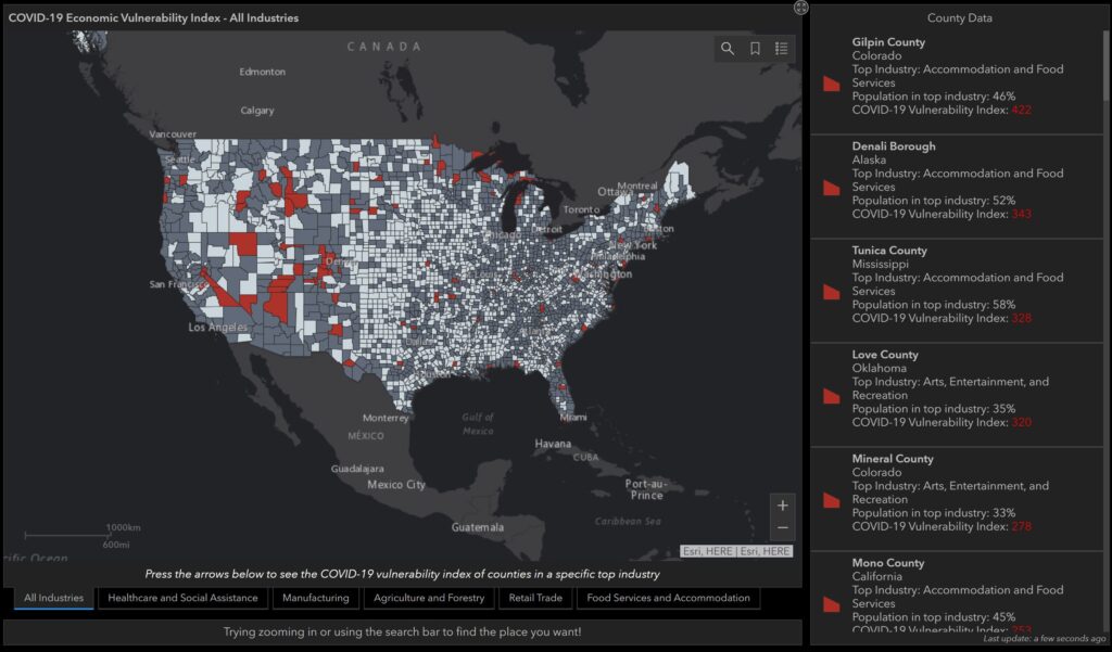
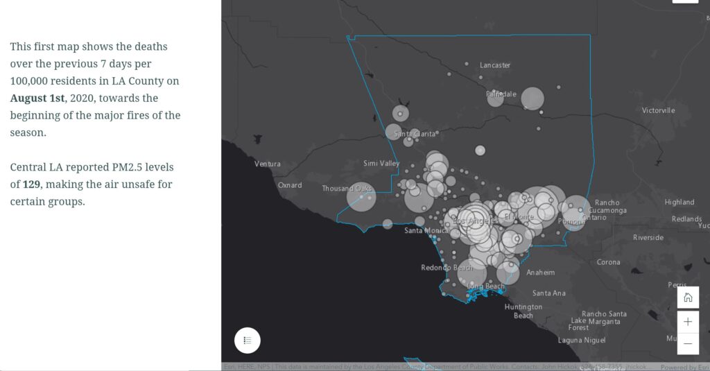
COVID-19 Rates in LA During Wildfire Areas by Sophie Penn (’23)
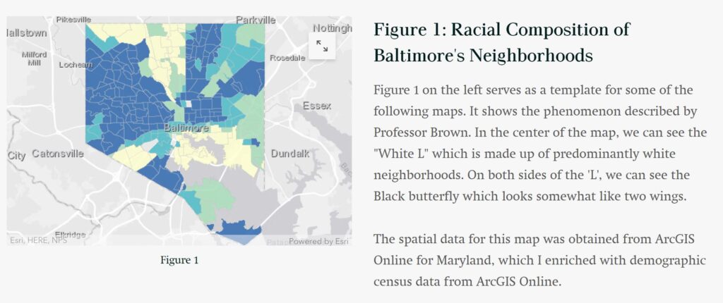
Rates of COVID-19 in a Racially Segregated City by Shea Peretz (’21 CSS, GOVT)
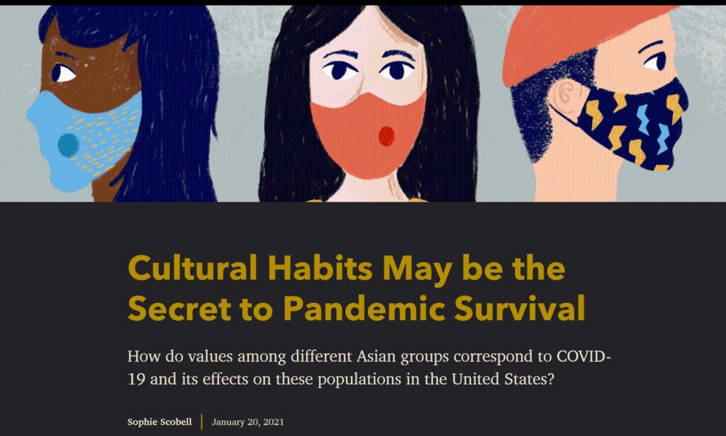
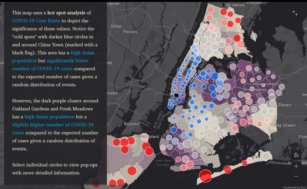
COVID-19 Rates among Asian Populations in NYC by Sophie Scobell (’22 BIOL, CEAS)
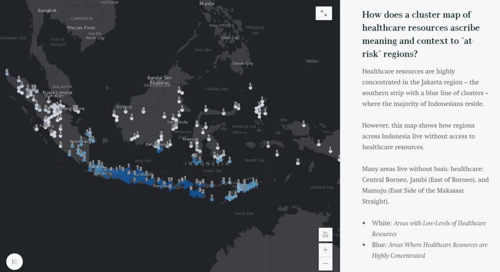
Healthcare Investment in Indonesia by Gabriel Snashall (’21 ENVS, GOVT)

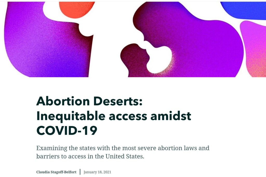
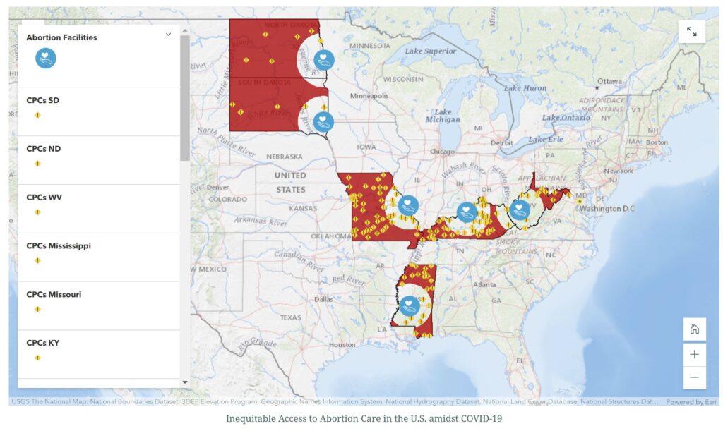
Mapping Inequities in Abortion Access during COVID-19 by Claudia Stagoff-Belfort (’21 BIOL, SISP)
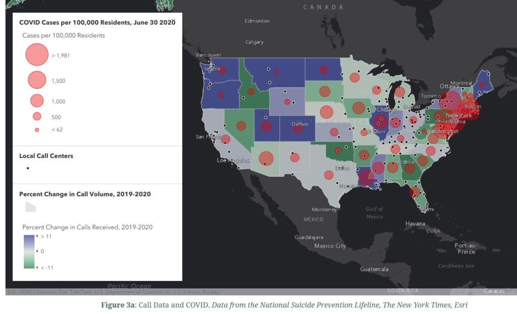
COVID-19 and the National Suicide Prevention Lifeline by Anna Tjeltveit (’23)
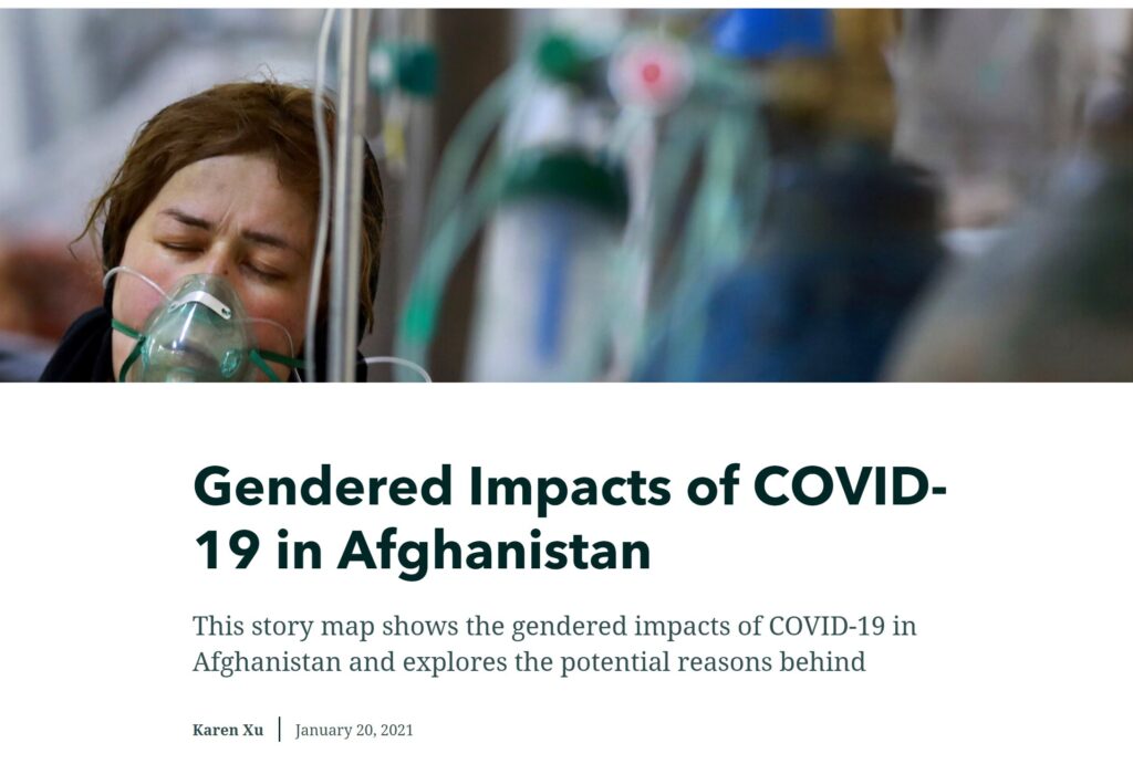
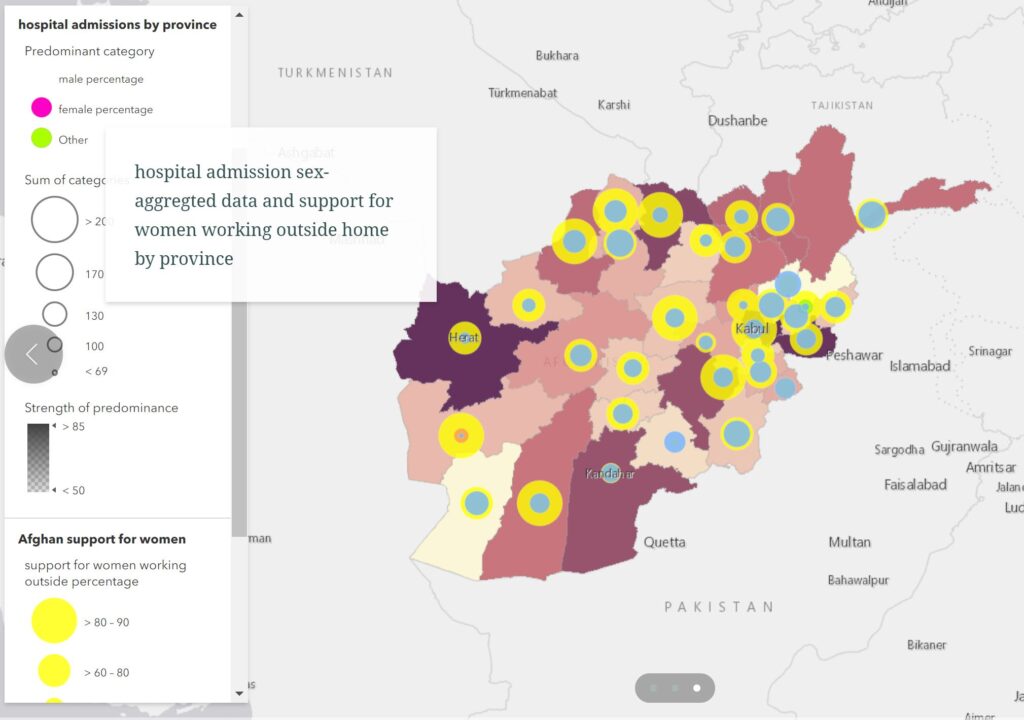
 Gender and COVID-19 in Afghanistan by Karen Xu (’22 ARST, ENGL)
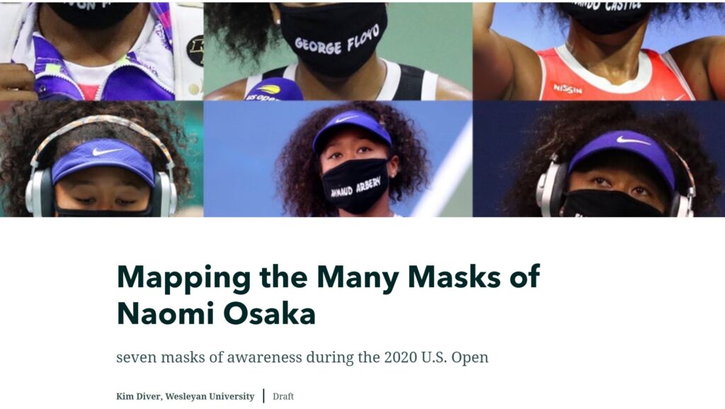
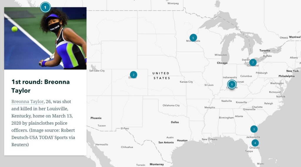
Mapping the Many Masks of Naomi Osaka by Kim Diver (instructor)