Skip to content Skip to content

WesGIS

Mapping and spatial data analysis at Wesleyan University

WesGIS
Logo: Wesleyan University
  • K Diver
    • Research
    • People
    • Teaching
    • cv
  • WesGIS
    • GIS Assistant Program
    • GIS teaching
    • GIS research
  • Newsfeed
  • Events
    • Workshops
    • Seminars
  • Gallery
    • Gallery
    • Student projects
    • Maps in the Media
  • Resources
    • Data sources
    • GIS blogs
    • Jobs & Internships
    • Training
    • Facilities
  • Equity

Death Toll Comparison Visualization

October 26, 2013October 26, 2013 by kdiver

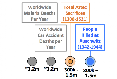
An interesting infographic illustrating human death tolls of significant events worldwide through time.

Categories Big data, Map gallery
Post navigation
Conservation GIS Class in Mexico
3D Map of Matterhorn by Drones

Recent Posts

  • CFPA is Hiring Summer Trail Crew
  • GISCI 2021 Map Contest NOW OPEN – Competitions for Students AND Professionals
  • Geospatial Trainer Intern position at Conservation International
  • Student Mapping the Pandemic course maps/apps in the news
  • Career opportunities at Blue Marble

Categories

© Wesleyan University